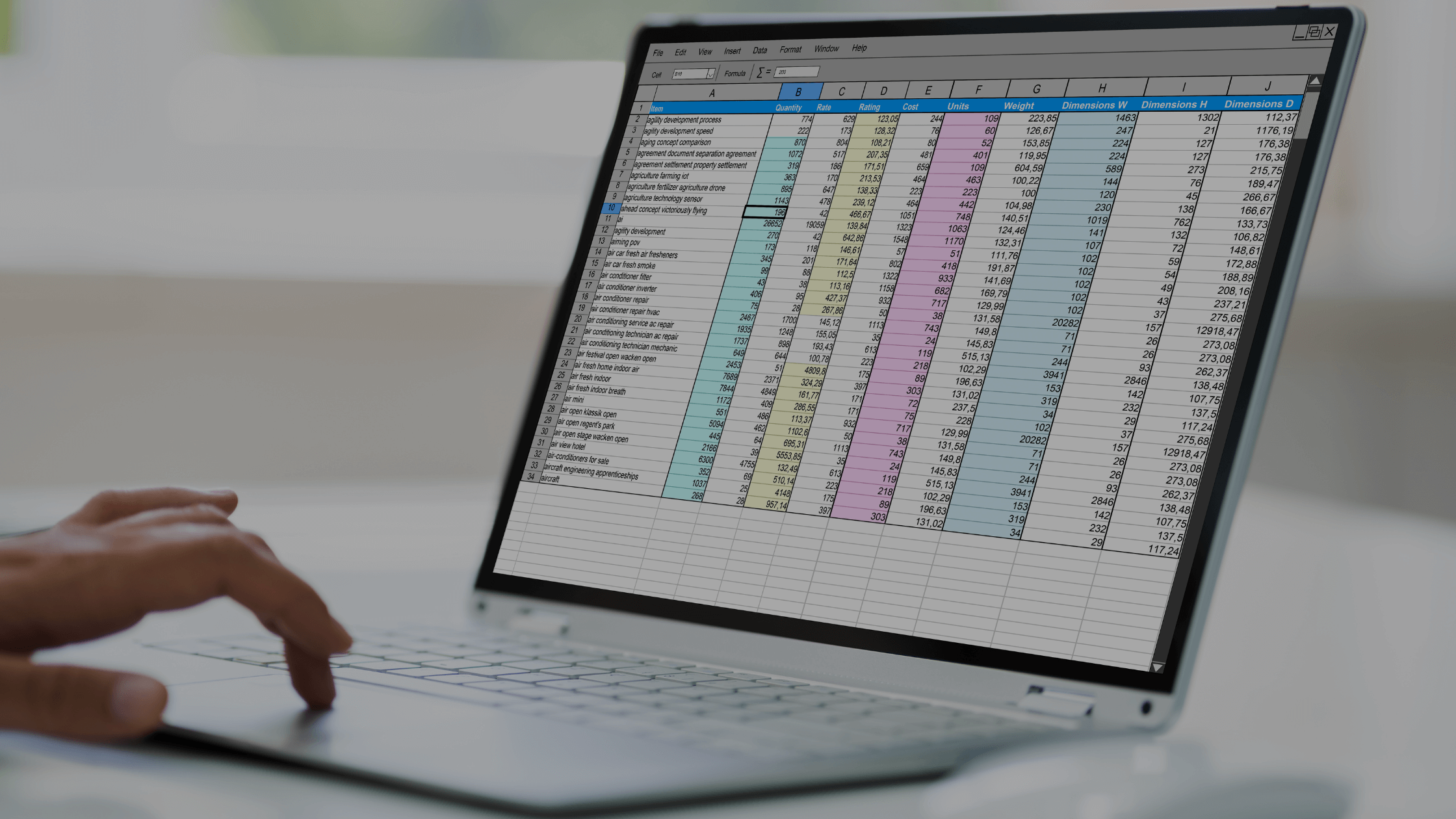
As a scientist, you probably use Microsoft Excel every day to keep track of your experiments, analyze data, and create charts and graphs. But are you using it to its full potential? There are a ton of Excel tips and tricks that can save you time and make your work easier. In this article, we’ve compiled some of our favorite and most helpful tips for scientists, so you can get the most out of this powerful tool.
Quick Tips for Efficiency in Excel
Hotkeys
The first rule of Excel club is do not use your mouse. Instead, you want to use hotkeys, which are keyboard shortcuts that allow you to quickly perform specific tasks in Excel. Here are some of our favorites:
F2: This hotkey is used to edit the currently selected cell. When you press F2, the cursor will be placed in the cell’s formula bar, allowing you to make changes to the cell’s contents.
F4: This hotkey is used to toggle between absolute, relative and mixed cell references in a formula. When you have a cell reference in a formula, pressing F4 will cycle through the different reference styles (e.g. from A1 to $A$1 to A$1 to $A1).
Alt+: This hotkey combo is used to access Excel’s ribbon menu. For example, if you want to access the Home tab, you would press Alt+H. From there, you can navigate to specific commands by pressing the corresponding letter key. For example, to access the Bold command, you would press B.
Macros
Macros in Excel are basically recordings of a series of actions you perform in the spreadsheet, saved as a set of instructions that can be easily repeated. For example, if you often have to format a certain column in a specific way or perform a complex calculation, you can record those steps as a macro and then run that macro whenever you need to do those steps again.
Setting up macros in Excel is actually pretty simple. Here are the steps to get you started:
- Go to the View tab in the ribbon and select Macros.
- Click Record Macro.
- Give your macro a name and choose a shortcut key if you want one.
- Click OK.
- Perform the actions you want to record.
- When you’re done, go back to the View tab and click Stop Recording.
- That’s it! Your macro is now saved and ready to use. To run the macro, just go to the Macros dropdown and select the macro you want to run, or use the shortcut key you assigned earlier.
One thing to keep in mind is that macros can only be recorded in the “Excel Macro-Enabled Workbook” format, so make sure to save your file as that type before recording your macro.
Named Ranges
Using named ranges in Excel can make working with your data a lot easier. A named range is essentially a custom label that you give to a specific group of cells. By doing this, you can refer to those cells by their custom label instead of by their cell references, making formulas and functions easier to read and understand. Here’s how to create a named range in Excel:
- Select the cells you want to include in your named range.
- Go to the Formulas tab in the ribbon and click on Define Name.
- In the New Name dialog box, enter a name for your range.
- Click OK.
Once you have created a named range, you can use it in your formulas and functions just as you would use a cell reference. For example, instead of using a cell reference like “A1”, you can use your named range like “Experiment A”. This makes your formulas much easier to read and understand, especially if you have a lot of data in your spreadsheet.
Data Validation
Scientists can use Excel’s data validation feature to ensure that data entered into their worksheets meets certain criteria, like being within a certain range or being in a certain format. For example, in a lab you might use data validation to ensure that data entered into a cell representing a test result is within a specific range of values. Here’s how you can do this:
- Select the cells in which you want to apply the data validation.
- Go to the Data tab in the ribbon and click Data Validation.
- In the Data Validation dialog box, choose Value under Allow and select Between from the drop-down menu.
- Enter the minimum and maximum values that are acceptable for the data in the Data field. For example, you might set the minimum value to 0 and the maximum value to 100 to represent a percentage.
- Choose an error message that will be displayed if an invalid value is entered into the cell.
- Click OK to apply the data validation.
Conditional Formatting
Conditional formatting in Excel is a great way to highlight specific data points or trends in your spreadsheet so you can easily see the most important information in your data. It allows you to apply formatting to cells based on specific conditions that you set. Here’s how to set up conditional formatting in Excel:
- Select the range of cells you want to apply the formatting to.
- Go to the Home tab and click the Conditional Formatting dropdown.
- Select the type of formatting you want to apply, such as Highlight Cell Rules or Data Bars.
- Set the conditions for the formatting. For example, you could highlight all cells with values greater than a certain number, or you could use data bars to show the relative size of values in a range of cells.
- Click OK.
And that’s it. Your conditional formatting should now be applied, and you can easily spot trends and important data in your spreadsheet. You can also customize the formatting to your liking, and even create your own custom formulas for more complex conditions. Just keep in mind that too much conditional formatting can make your spreadsheet look cluttered and harder to read, so use it sparingly and with purpose.
Data Management and Organization
Keeping your data organized and manageable is crucial when using Excel in the lab. Here are just a few of the way Excel makes it easy for scientists to quickly find the data they are looking for.
Sort and Filter
Sorting and filtering are great ways to quickly and easily make sense of large datasets, and can save you a lot of time compared to manually searching through and organizing data.
Sorting allows you to rearrange the data in a particular order, like ascending or descending, while filtering lets you focus on specific data based on certain criteria.
Filtering is useful for narrowing down your data to just the specific information you need. To filter data in Excel, you can use the “Filter” option in the “Data” tab.
VLOOKUP
VLOOKUP is a powerful function in Excel that can be used by scientists to quickly retrieve data from a large data set. This can be especially useful for scientists who need to analyze data from multiple sources and want to avoid manual data entry.
Imagine you have a large data set with thousands of rows and columns, and you want to find the value of a specific parameter (e.g., temperature) for a specific date. You can create a separate table with two columns – one for the date and one for the temperature. This table can be used as the “lookup table”. To retrieve the temperature value, you can use the VLOOKUP function.
The function requires four arguments: the value you are searching for (e.g., the date), the lookup table, the column number in the lookup table that contains the value you want to retrieve (e.g., the temperature column), and an optional argument to specify whether the function should return an exact match or an approximate match. After entering the function, you can copy and paste it into as many cells as you need to retrieve the values for multiple dates.
IF and IFS
Scientists can use the IF and IFS functions in Excel to make decisions based on certain conditions. The IF function allows you to test a condition and return one value if it’s true and another value if it’s false. For example, you could use the IF function to test whether a cell’s value is greater than a certain number, and return “High” if it is, and “Low” if it’s not.
The IFS function is similar, but it allows you to test multiple conditions and return a different value for each one. For example, you could use the IFS function to test if a cell’s value is less than 10, between 10 and 20, or greater than 20, and return “Low”, “Medium”, or “High” respectively.
Both functions can be useful in scientific data analysis, where you may want to categorize data based on specific conditions. To use them, you’ll need to enter a formula into a cell, specifying the conditions and the values to return based on those conditions.
Pivot Tables
Pivot tables in Excel can be incredibly useful for scientists who need to analyze and summarize large sets of data. They allow you to organize and rearrange data in a way that makes it easier to identify patterns and trends.
Pivot tables have many powerful features, like filtering and sorting, that make it easy to answer specific questions about your data. And because pivot tables are dynamic and automatically update as your data changes, they can save you a lot of time and effort compared to manually summarizing large datasets.
Statistical Analysis
Excel is a versatile tool that can be used for a wide range of statistical analyses. Excel offers a wide range of statistical analysis tools, such as charts, graphs, and pivot tables, which scientists can use to visualize and analyze their data. Here are some ways to use Excel for statistical analysis in the lab.
Descriptive Statistics
Once the data is organized, the scientist can use Excel to calculate descriptive statistics such as mean, median, mode, and standard deviation. This can be done using the built-in functions in Excel, such as AVERAGE, MEDIAN, MODE, and STDEV.
Graphs and Charts
Excel’s charting and graphing tools allow scientists to create visual representations of their data, making it easier to understand and communicate their findings, patterns and trends. Here’s how you can use Excel to visualize data with charting and graphing:
- Open your Excel sheet with the data.
- Select the data you want to include in the graph.
- Go to the Insert tab and select the type of chart or graph you want to create, such as a bar chart or a pie graph.
- Excel will create a chart using the data you selected.
- You can customize the chart by changing the color, adding a title, and labeling the axis.
- Now you have a visual representation of your data that makes it easier to see results. By using charts and graphs in Excel, scientists can effectively communicate their findings and insights to others in a clear and concise manner.
Inferential Statistics
Inferential statistics allows you to make inferences about a larger population based on a sample of data. For example, you might use Excel to perform a t-test to determine if there is a significant difference between two groups of data.
Regression Analysis
Regression analysis is used to model the relationship between two or more variables. In Excel, you can use the built-in regression analysis tool to create a regression model and make predictions based on the data.
Interpretation
Finally, you can use the results of their statistical analysis to interpret the data and make meaningful insights. This might involve using the results of the descriptive statistics, graphs, and inferential statistics to draw conclusions and make recommendations.
From this point on, if someone tries to enter a value that is outside of the specified range, they will see an error message and will not be able to save the invalid data. This is a great way to ensure that the data entered into a specific cell or range is accurate and consistent, making it easier to analyze and interpret.
Simulation and Modeling
By using Excel’s powerful calculation capabilities for simulation and modeling in the lab, you can quickly and easily explore different scenarios, analyze results, and draw insights that can help you make better decisions and drive your research forward.
Start by organizing your data in a spreadsheet with clear, descriptive headings for each column. Then you can use Excel’s formulas and functions, such as IF statements and VLOOKUP mentioned above, to create a model that represents the relationship between different variables in your experiment.
Use Excel’s built-in tools, such as Solver, to run simulations and explore the impact of different variables on your model. Charts and graphs can help you visualize the results of your simulations, and compare different scenarios to see which ones produce the best outcomes. You can then use Excel’s data analysis tools, such as PivotTables or Regression analysis, to analyze your results and draw insights from your simulations.
Data Sharing and Collaboration for Scientists in Excel
Excel is a great tool for scientists to use for sharing and collaboration in the lab. It allows you to create organized and easily readable data spreadsheets that can be shared with your colleagues. One of the best things about Excel is that multiple people can work on the same document at the same time when you create shared workbooks, so it’s easy to collaborate with your lab partners. You can assign specific sections or data sets to different people, or you can all work on the same sheet and make changes as needed. Excel also has a robust commenting system, which is perfect for leaving notes and feedback for your team.


